I Heart New York – Tourism Marketing Turned Fashion
By Charlie Elizabeth Culverhouse
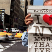
The ‘I <3 NY’ logo is everywhere. It fills not only souvenir shops, billboards and murals in New York, but is found on a variety of merchandise all over the world. You’ve likely drank from a mug, wore a keychain, or sported a shirt with the iconic logo on – even if you’ve never stepped foot in the state, let alone the famed city.
The simple logo changed the worldwide perception of New York in what can only be called the most effective and well received marketing campaign to have ever been run. So how did the logo come to be? And why did it have such an impact in New York?
The story starts in the 1970s. New York City was experiencing a devastating economic crisis and many areas of the city were dangerously close to hitting rock bottom. In 1975, President Ford denied federal aid to rescue the city from bankruptcy – the headline “Ford to City: Drop Dead” explains the anger many New Yorkers experienced. The economic crisis led to many issues throughout the city; specifically crime rates and drug use soared to a historic high. Bad publicity ensued and gave New York a reputation that, to word it lightly, discouraged tourism – adding to New York City’s already failing economy.
New York was in dire need of a makeover and it needed it fast. The morale of New Yorkers was at an all time low and many began to abandon the city. As well as a reputation turn around to encourage visitors to New York, the state needed a way to encourage its own citizens to stay.
To fix the problem, the New York State Department of Commerce turned to advertising agency Wells Rich Greene. The agency had a big task on their hands; shining a positive light on New York was sure to be difficult in light of the state’s devastating economic and social issues.
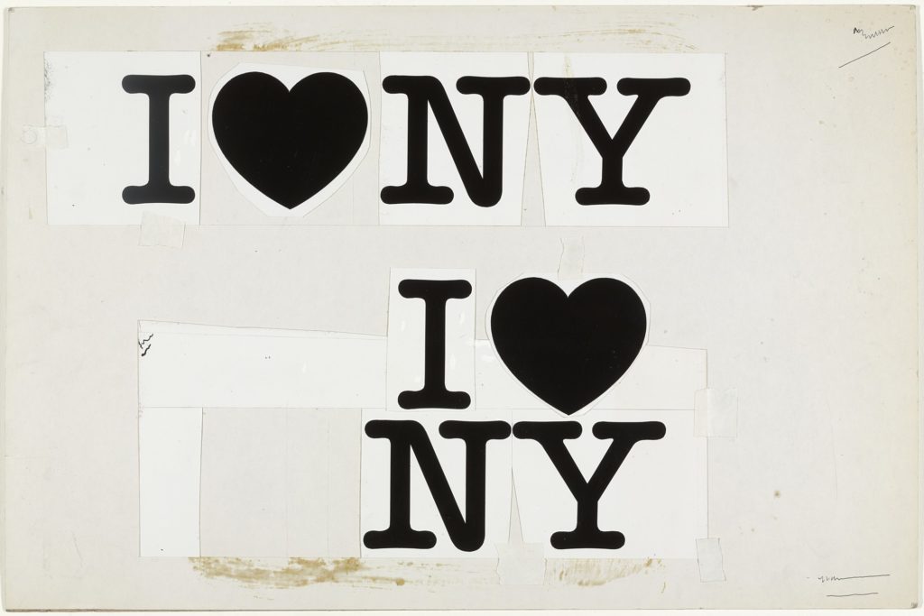
The team quickly pulled together several important components; a slogan (“I Love New York”), a jingle, and a television commercial. But something was missing – a logo.
Graphic designer Milton Glaser’s impressive portfolio and love of New York City cemented him as the man for the job. Glaser’s portfolio boasted a portrait of Bob Dylan enclosed in the singer’s greatest hits album, the design of New York magazine which he founded in 1968, and the visual identity of a restaurant in the World Trade Center – pretty impressive.
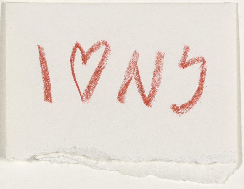
In a taxi on the way to meet with Wells Rich Greene, Glaser quickly scribbled a logo design onto a scrap of paper to show the team. Using a bright red crayon, unbeknownst to him, Glaser changed the face of New York City forever.
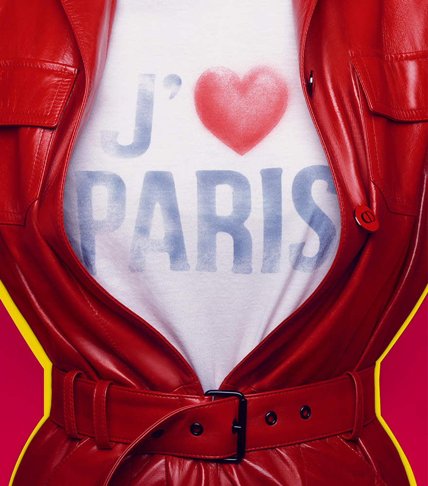
The ‘I <3 NY’ logo was the first step in showing New York as a positive place to be. While now we take the logo somewhat for granted as a tourist staple, the design is groundbreaking. Glaser’s design was one of the first examples of an ad campaign using a heart in place of the word love, and it’s simplicity and transferability is what made it brilliant – and easy to copy. ‘I <3 blank’ has been imitated across industries, countries, states and cities as advertisement and the oversaturation has left the logo feeling unoriginal and sometimes tacky.
Taking inspiration from the pop-art style, the logo was a hit and rapidly spread across New York in the form of simple white t-shirts, mugs, stickers and even license plates. Many New Yorkers, who had been watching their city crumble around them, took the heart design as a sign of hope. The simple proclamation of love became a rallying cry among citizens and encouraged them to join together and fight for their beloved home instead of abandoning it.
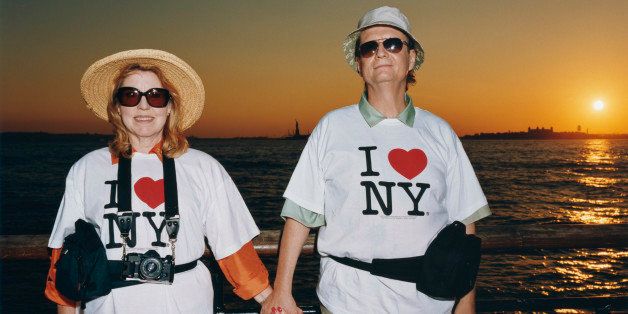
Soon everyone wanted to proclaim that they, too, loved New York – in the city, and beyond. The simple logo printed on a white t-shirt became a fashion statement far and wide. Those who had never been to the city wanted to go, wanted to say they’d been there and ‘got the t-shirt’. The marketing team had done their job tenfold, they’d cemented New York as the place to be.
The stacked nature of the logo allowed the design to be placed across many different mediums, giving it greater exposure than your typical logo designs. This was in a time before websites and social media, the logo had to speak for itself and had to be seen everywhere – on t-shirts, hats, mugs, metro cards and more. Anything pertinent in the daily lives of New Yorkers was invaded with the logo and it was impossible to ignore its message.
The campaign was expected to go on for a couple of months, but after their success, ended up sticking around for years – decades even. The message, and more specifically the logo, became so ingrained into the public consciousness and New York culture, that even without the help of a marketing team, citizens and tourists continued to advertise the state through a variety of promotional materials. Each person wearing an ‘I <3 NY’ t-shirt is a walking billboard reminding people to visit the city!
The t-shirt was the smartest choice of merchandise for promoting New York. Notoriously New York City is dominated by walking – fast walking – so billboards and posters are less visible or are simply missed and ignored by passers by. The culture of New York, highly confrontational and in your face, is perfectly suited to the branded t-shirt which unapologetically jolts messages into the faces of those you see on your commutes.
The popularity of Glaser’s logo worked in not only promoting New York City, but also in making it a whole load of money. The “I Love Blank” phrase has been copied across the globe in not only souvenir shops but also by big fashion brands. Because the trademark is owned by the New York State Department of Economic Development, the state of New York has filed more than 3,000 objections against those infringing on Glaser’s design.
The logo brings in more than $30 million profit annually in official merchandise. That doesn’t include the money brought in by tourism thanks to the campaign, the money won in lawsuits filed by the city, or by the boost to the economy thanks to the logo. Like we said earlier, this was arguably the most effective and well received marketing campaign to have ever been run.
But Milton Glaser hasn’t received a cent of the profit made thanks to his logo design. He doesn’t own the trademark, and even more unbelievable, he worked on the campaign pro-bono – that means he created the iconic New York logo for free!
So, is he, like most people would be, slightly miffed at this fact?
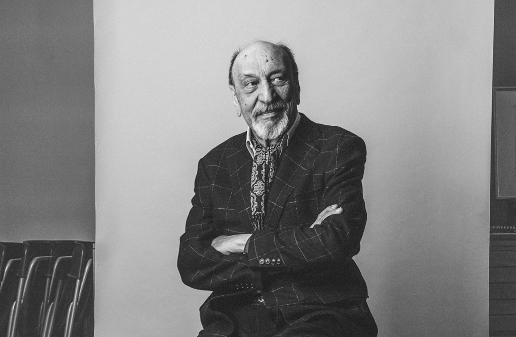
The answer is not at all. Glaser did the work in the name of helping the city he so loved – money wasn’t the issue on his mind. He knew he could make a difference, he knew he could improve the lives of people with a simple red crayon. While Glaser hasn’t received any money for his design, he’s received more than his compensation in fame. Since designing the iconic logo, Glaser has worked on a multitude of significant designs as well as being the first graphic designer to win America’s National Medal of Arts in 2009, largely due to the logo’s success.
For Glaser it’s not about the money or the fame, he can settle in the fact that, majoritively thanks to him and his work, New York City is what it is today. Sometimes it’s the smallest, seemingly most insignificant actions that can create such huge change. What started as a last-minute doodle in the back of a taxi became a beacon of hope that brought a city back from the brink.
Discover more from GUAP’s Fashion section here